Thursday, 29 March 2012

Album Advertisment.

To begin with I wasn't sure how to present my album advertisement but by having a look at these two and doing a small analysis on the two it gave me abit more knowlege on how to present my own. 


As you can see here this album advertisiment is the same picture taken from there album cover so people can reconise it, if it was a different picture the audience my be un sure of what album they are trying to promote. I like hoe all the text is in a simular colour apart from the 'Out Now' which is capatilised to put emphasis on this word and for it to stand out to the viewer, I would also like to do something like this to let my target audience know that the product that I am promoting is out. The Title of the band Is in big writing at the top of the page, so the viewer can see what band the album is advertising. The kings of leon name it's self is a brand image and is reconisable to the public. On the bottom left corner there is a play.com symbol, having this on there will promote the product but also help out the other company by selling. Effectivly I like this album advertisment as I can clearly reconise it with the album cover and with the band name being so big I can straight away see what band it's advertising. 


The view is an indie band, so I thought by looking at there work I will see the conventions of this. The title of the band is most dominant on the advertisment, then it's to title of the album, again like the kings of leon advert, they have used there album cover to again promote themsleves. To contrast this advert has the release date of the CD so we can see here that the poster is advertising before the relase so the audience are aware of when they can by this ablum. I like all the little scribbles and annotations this links with the target audience and is something different, young and fresh. The love heart in the middle, tells the viewer that inside the songs are going to about love. I like how simple this advert is although it has everything the viewer needs to know. 

Sunday, 25 March 2012

Analysis of CD covers.


After looking at this CD front cover I would like to try the same thing of putting all four of my band members as one, this is showing there connection and unity as three different people in a group together to make one. On this, the people do not match up perfectly this is something I would like to try, attempting to use three people to create one person. The colours of this album cover create a sense of jealously, so maybe this has something to do with the lyric inside, I like how this picture also includes some cartoon eyes and a beak of a chicken, although the band members faces look quite serious and sinister this creates a comical but mysterious effect, to question the viewer of why are they wearing a mask and why can we not see all of there faces.


This CD cover by the Beatles again shows a range of photo's of each of band members, this shows five photo's of each of the members pulling a different pose, again creating and showing the different personalities through this. However unlike the poster, these photos are all in the same effect and look as if there wearing the same top and also look like they have the same hair, which makes it hard to distinguish one another at first. These photo's are in black and white which I think is effective. 


This pop art picture, of the Beatles, is really eye catching, the way it uses different unique effect to show all four of the band members personalty through these effects. They are all doing different poses, and they are all shown in different colours. The composition of each of the photo's is a close up shot, of the shoulders upwards, this allows the viewer to focus upon closely to the faces. The angle of these pictures are all slightly from a low angle, looking down on the characters. The different colours attract me to this picture, but also the way each of the band members are presented I like how it allows them to be different and show there uniqueness through this. I really like this picture and I intend to look at other works similar to this and then hopefully to create my CD cover similar to this. 

Friday, 23 March 2012

Analysis Of Music Magazine Front Covers.

For my band, I will also create a magazine front cover in order to promote the band. I will look at a few music magazines that link with the same genre as my band, so they can connect and link together. My aim is to create a music magazine that is inspired by NME and Kerrang magazine. I will now analysis four different covers from each of the two magazines to get ideas for my created magazine. 


From the top, there is a black strip with white writing listing the name's of other Rock bands featured in the magazine. The juxaposioning colour's symbolise the rebellious feel the rock genre displays, these colours could also symbolise good and bad, dark and light, and heaven and hell. The band names are separated by stars, this links with the "Rock Star" lifestyle of living in Hollywood and having your name paved into the floor. This connotes the rich, relaxed, rebellious, successful life that celebrity is living. The star's are red displaying the dangerous, living on the edge, life the RockStar's like to live. 

Underneath is the significant, name of the magazine Kerrang, with an acclimation mark. The font includes the name looks as if it is shattered glass, this links with the stereotypical actions of rock stars when they smash guitars at gig's. This shows they have a attitude as if they don't care, and want to do as they please. 

The colour of the font is black with a white background, this makes the brand name stand out. In the foreground, the band Panic At the Disco, are the main image taking up most space. The shot is from a high angle with the band members looking down at the camera. This makes the band look dominant above the audience, and almost powerful in a sense. 

Just below the the band members, is the band members name, which is in there brand image, which is the font, the audience recognise this. In what looks like red scribble the white words, and the capitalisation of the word FREE, are presented. 

Then there are some pictures to show what bands have speical articles in that issue, and also advertises the free poster which is in the magazine, the word PLUS, also capitalised and is excalmitive, creates emphasis on the word, and then tells you what is also included in this weeks magazine. 

Monday, 19 March 2012

Imovie.

The software I used to edit my was Imovie, I found that this software was easy to use and it had everything I needed to do was on here. Having a Mac at home aloud me to use Imovie before which make me feel confident using the software. There were a range of techniques to use on Imovie, some of them being, cutting, cropping, transitions, photo's, adding sound, video adjustments, audio adjustments, cropping and rotation, changing things like brightness, exposure, contrast and saturation, video effect and there are lots more. Below I will talk through the technique's I have used.


This was the tool bar which allowed me to take the photo's straight from Iphoto and drag them to my movie. Again I found this very easy to use. By press the command button it let me select more than one photo which I wanted to include. 


This slide bar, let me control the size of the screen. Weather I wanted to have it smaller of larger. 


This red line was the line that determined where the music video was playing. This lets you edit exactly what bit you want to maybe take out, crop, or whatever it is that needs to be changed. 


The little icon that looks like a bolt, gives you the options to, precision editor, which allows you do to do things even more precisely. The clip trimmer, lets you cut down the duration of the clip. 


The clip adjustment lets you change the duration of the clip, pick a video effect, change the speed of the clip, so if you want to speed something up or slow something down. And also the stabilization, so to allow the clip have a smooth motion. 


The video adjustment lets you edit the presentation of the picture, so the brightness, exposure, contracts, satureation, and also the white point allows you to adjust the white point on part of a picture. There is also an auto button which with adjust the shot automatically. By clicking the auto button it might to be to the way you wanted as it's not done manually, but it can work sometimes. 


The Audio adjustments lets you control the volume of the clip of even take all the volume off. The option of ducking, lets the volume to reduce of the other tracks been played. The fade in and fade out, makes the start and the end of the music, and again it allows a manual which lets you choose it by yourself, or automatically. 


As you can see there are lots of different effect to choose from, there is flipped which flips over the shot, raster, cartoon, aged film, film grain, hard light, day into night, glow, dream, romantic, vignette, bleach bypass, old world, heat wave, sci-fi, black and white, sepia, negative, and X-ray. The only effect I used was the black and white effect, I did this whenever I showed the narrative, in black and white to show the past, I have also shown the shows this as the shoes represent the narrative of the boy and girl. I have done everything eles in colour, to present that this is in the present. 


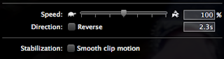
This is the speed opmiter that by either dragging or typing in the speific percentage, I used this when I filmed my main singer at the bus stop alone to show his loniness and vunerability. I sped mine up about 2000% this was because when I dragged the pointer to the fastest point it wasn't quick enough and the shots were still too long. So I had to change the percentage myself, but this worked alot better. There is a tick box underneith the speed, is a direction reverse, which allows the the clip to go backwards. 


This is the music table which lets you choose music from garage band, Itunes, music, movies, as you can see my music choice of vanish is on there which I simply dragged to my project, and the music played in the background of my music video. 


When I connected my camera to the computer to upload my footage, all I had to do was to click this button and it would show my footage with a tick box under each one of them. This lets you chose the shots you want to upload. 


This was the name where I put all my footage this allowed me see all of my footage from the different filming days, letting me chose different parts if I wanted too. 


As you can see the bottom where I have called Charlotte's music video this was where all my footage was, so I didn't get mixed up with anyone eles footage and made it easier for me to chose what I wanted to pick. 


This is the project gallery, where the different projects are kept, so here I've kept my first, second and final draft and this was easier and it helped me not get mixed up with my other drafts. 

Thursday, 15 March 2012

Brand Image.


The dictionary definition of brand image : The impression in the consumers' mind of a brand's total personality (real and imaginary qualities and shortcomings). Brand image is developed over time through advertising campaigns with a consistent theme, and is authenticated through the consumers' direct experience. 

My brand image for my brand is the name of the band in the same font of Letter Gothic. I have kept this the same throughout so my target audience can recognise my band. I have used this by promoting my band though my digi pack. 

Tuesday, 13 March 2012

Pixilated

I am really happy with my finished project, although the thing I'm not happy about most is the quality of my product, I think it takes away the effect it has when its not pixilated. When  uploaded my footage to the mac's It went a tiny bit pixalated then and when I exported it to the desktop, it became a tiny bit more and when I uploaded it to blogger, it is just a really poor quality and it doesn't focus on little detailed like lip syncing which I wanted it to do. 


Sunday, 11 March 2012

Rejected Shots.


Clip One.
The first shot shows Reece, looking down, there were a lot of shots like this, because as I was filming, I was stood quite far away so it was hard to judge when he was about to go. The second shot where you can see he is wafting his hand, there were people at the park that wanted to go across and they asked him if they wouldn't disturb the filming. Sometimes Reece got a bit smiley and would laugh, as I think he found it hard to try pretend that the camera isn't there. When Reece put his thumbs up this was a signal to me that he was about to start. All these I cut out as this was relevant to my music video. The next shot where Reece is fixing his bike, this was an accident as we was filming, Reece broke the chain whilst riding the bike. I was thinking of maybe adding in my music video to create a comical effect that his bike had broken, but it didn't look right. And finally, there was a man at the back of Reece while we was about to shoot, Reece didn't realise the man was behind him and the man didn't realise we was filming, I rejected this shot as the man from behind takes away the main focus of Reece. 

Clip Two. 
Clip two shows the band playing there instruments, although I included most of this footage, there were some I didn't. Firstly, the band are just sat on the rocks and they aren't playing the instruments as they are waiting for the music to play in order for them to start singing along with the music. And the next shot shows the band playing then they finish the bit they were to film, so they stop playing there instruments. If the band are just sat there not playing, it doesn't give a realistic feel that they are an actual band, but by making them play, it looks more realistic. 

Clip Three. 
This was when I filmed the start of the narrative, here I have not realised I have pressed the record button, so the camera is pointing at the floor. When the shot then cuts to Sonal, you can see the camera hasn't focused properly. The next shot in the clip is pointing to the floor again, here I was directing Sonal where to stand, and again didn't notice I had pressed the record button too early. 

Clip Four. 
This clip is a whole shot I took of Sonal ordering a drink from the bar, I asked the bar member If I could film and he was fine with it. Unfortunately I didn't use any of these shots as it looked strange as there wasn't a wide range of shots, it was just the shot in the same place. But also, it would be nice if Reece would of brought her the drink, but because of Reece being under-age we didn't want to risk to be turned away. If I was to do this shot again, I would of made Reece by the drink and used a shot reverse shot to show the bar tender making the drink and Reece buying the drink. I would also done, an extreme close up of the man putting the lemon aid in the drink, or Reece giving his money to the man. Also because I didn't have the large tripod, this shot was hand held, making it hard to keep the camera steady. 

Clip Five.
This shot was taking from a different point of view of the couple sat on the sofa, It shows Sonal getting up and walking away, but then she turns around and smiles whilst she waves goodbye. I liked the angle of this shot, although the actors didn't look serious enough, and the wave didn't look realistic, as you wouldn't wave to someone if your going to the toilet. 

Clip Six. 
I really like this shot of looking at the actress through the mirror, this shot was meant to show her looking in the mirror and looking sorrowful as she wants to break up with Reece. I told her to pretend that she was washing her hands and looking through the mirror, but this shot was too long. And when she went to dry her hands there was nothing that related to this. Then when there is an close up on her texting, there is a crack in the mirror, which just distracts the eye from what the camera is ment to be focusing on. 

Clip Seven. 
At the start of clip seven, we were figuring out how we were going to go the hand held, shot following sonal, this would fit in where the lyric's say, "walk away." I was going to film this hand held camera but then when Reece held the camer it was easier to have a match on match action with the back of sonals head, as he is alot taller. The final shot is when we have finished doing the hand held shot, sonal has walking of the door and I must of accidently left the camera on. 

Clip Eight. 
This was the last shot on the second day of filming. This was when we was in the bus station, I planned to film about 10minutes and betime I've sped it up it will be enough time in the music video. I set up the camera by putting the mini tripos and wrapping round the arm of the chair I warned Sonal and Reece that it would take this long, so in this shot, sonal went to get her phone out of her bag. I wouldn't use this shot as it again takes the focus away from Reece. 


Friday, 9 March 2012

Final Cut, Audience Feedback.


  • It is really well editied and the use of a filter allows the viewer to access the back story.
  • The acting in it isn't the best. 
  • Some of the camera angles, shots, and speeds allow a great use of variety to keep the viewer entertained and intreagued. 
  • Lip syncing is really good.
  • The mood of the video potrays the lyrics well. 
- Sam Davies.


  • It's alot better now the backing track has been taking out.
  • The camera shots go with the beat of the music which is a good effect. 
  • The narrative is really good and goes well with the lyrics. 
  • The lip syncing is good.
  • The shoe idea is well filmed, and edited, and works really well with the lyric's.
- Sonal Mistry.


  • The lip syncing is now alot better.
  • I like the shoes, that works really well.
  • There is a range of different shots which make it interesting.


Wednesday, 29 February 2012

Final Cut.


Here is my final cut, after the feedback I have received, I took into account to bring back the bike idea, as it was something to add in so there were lots of different clips going off and the audience didn't get bored. I also added in the shoe Idea, I think it worked really well, and again kept the audience interested. Some people mentioned about when the main singer says "oh, oh" at the start but I quite liked that idea, and I think it was edited properly, so it worked, it was also a bit different and quirky as it jumped. This cut is quite similar then my second draft, although some things have been taken out and added in. I've shortened the narrative by putting the shoe's inbetween. I noticed, when my audience was watching my first draft they got distracted and would not really be watching it, whereas when they watched this cut, they seem alot more interested, as there was a lot more going off. I am really happy with my final cut, although it wasn't my original desire to film what I've filmed but I think this idea is alot better and it relates to the lyric, which my first idea didn't. 

Tuesday, 21 February 2012

Shoe Idea?

(Picture of White shoes)

The friend that gave me the idea for the band, watched my music video and suggested with the lyric's being about shoes, why not include shoes. The lyric's start with "Bye bye, my white shoes." later on in the lyric's, it says, "Bye, bye my black shoes." So I got a pair of girls, white plimsolls and some dark boy's Fred Perry shoes, and took lots of photos to make it look like I've used stop motion. I tried this for an experiment and if I didn't think it worked I was going to leave it out. I felt like it did work and as I showed people the finish idea, they really liked it, and thought it went perfectly with the lyrics. Shooting the shoes also allowed me to represent the relationship between the narrative of boy and the girl, together then not together. I first did displayed the shoes in colour but after a bit of feedback, it was evident that people thought it would look better in black and white. 

                                                                        (Picture of Black shoes)

Saturday, 18 February 2012

Rough cut 2 Audience feedback.


  • Some of the shots are too long, it get's a bit boring.
  • The range of shots work well.
  • The shot where the girl and boy are on the sofa and they move along it, is really good.
  • The shot's need to change due to the change in music. 
  • I think the opening's really strong with the different instruments. 
  • I'm not too sure about the bit at the start where the main singer says "oh, oh" 
- Declan Prendagast. 


  • The new location is alot better, it buts up the music video abit.
  • I like the flash back on the girl, when she turns to look at the camera.
  • The narrative works well.
  • The sped up shots at the bus station works really well, cut inbetween the band playing, it doesn't get boring.
  • The shot where the girl is going through the door, it isn't quite matched up quite right.
  • Some shots, the boy is looking at the camera and doesn't look right. 
  • The lip syncing is alot better. 
  • I liked the bike idea, there was just too much of it. I would like to see the bike come back in. 
- Sonal Mistry.

  • The start is good with the instruments, but the shots but the location needs to change quicker.
  • When the lead singer was on the bike that worked well, only some of the shots lip syncing was not right but I think this idea was good.
  • When the boy and girl move up the sofa that's a good technique. 
  • The lip syncing is alot better here.
  • When there is a flashback of the girl looking back, I dont understand why the filter has changed. 
  • The narrative works well. 
  • When the singer is at the bus station again another really good shot. 
  • I like the hand held camera when the girl is walking away, it's as if we are the eye's of what the guy is seeing, which makes it feel personal. 
- Sam Davies. 

Friday, 10 February 2012

Rough Cut 2


After the feedback from my first draft, most people were agreeing that I need to film in a different location. They liked how it was filmed outside, but a change of scene would make it more engaging. They also mentioned that there needs to be some sort of narrative that links with the lyric's, so after looking through my analysed lyric's it was evident that the song was about a boy and a girl, and her leaving. So I came up with the idea of having a boy and girl spending time together, then she breaks up with him and leaves. 

My next thing was the location, where was I going to film it? With the indie rock genre in mind I decided a rough, grungy looking pub would look good, as it would be typical of an indie to hang out, doing open mic nights and generally going places like that to socialise. I wanted to get this filming done quick, so I planned to have only one hour to do the pub scene in. It didn't take long to film and it was alot easier as there were no instruments to carry. 

After filming me went to Victoria Bus station, to catch my bus and then an idea came into my head, of filming Reece (The main singer) in the bus station sat by himself, and fastforward the footage creating from inspiration off Ed Sheeran's A-Team, where the girl is stood in the same potion and the traffic is moving faster. I wanted to do this with Reece but have him sat at the bus stop with the people rushing past him. This was a really quick idea, and didn't know if it was going to work, but it was a success and I think it looks really effective in my music video. 

With the footage of the narrative, I decided to take out all the footage of Reece riding his bike, and replace it with the narrative.

Wednesday, 1 February 2012

New Location.

After gathering feedback off some people they mentioned about having a different location so I chose to go to a pub and film some sort of narrative to fit with my lyric's. My plan here was to film a girl and a boy in a relationship, there happy, and then they break up. 


Saturday, 28 January 2012

Music Video Rough cut One Feedback.


  • Some nice editing - when they swop instruments.
  • Most of the lip syncing are in time but some is not. 
  • There are a few moments where the actors look directly at the camera removing the audiences viewing of the antic's.
  • Actors don't look very enthusiastic.
  • I think that the video is currently too much of the same, what do the lyric's of the song link with the video, I don't think there is alot of diversity in shot's mainly close up's or lomgshot.
  • Maybe apply some transitions possibly add POV on the bike / establishing shot of the park. 
-Sam Davies


  • Need a smoother camera tripod, it's too jerky. 
  • Improve lip syncing, make sure it's in time.
  • The change of instruments is a good idea, keep this idea.
  • Keep the shot where the band members are walking past the dungeon tunnel. 
  • Needs another location.
  • The shots are too repetitive. 
  • Cut the shot at the end with all three band members walking either side of the bike. 
-Sonal Mistry.


  • The bike idea is good.
  • Some of the shoots need to be smoother.
  • The shots get boring and repetitive.
  • Maybe go to a different place to film, to make it more exciting.
  • Some of the lip syncing is out of time. 
  • Starting the singing with the main singer on the bike works well. 
  • The end aswell works well with them all together, with the main singer on the bike.
  • When the band are playing thats a nice location. 


- Connor Ball.

Tuesday, 17 January 2012

Stockers now been signed.


For our music video we were advised by our teacher to chose an unsigned band/artist. This was to aviod the same ideas for popular music videos that already have a music video but so it's also easier to come up with our own interpretation of the song. 

On January 17th I saw that Stockers! announced on facebook that they had been signed a record deal with studpio records. I thought that this was really a positive thing for the band as it would be evident that they are a popular band, which makes it better as my chosen music video song, people will like and want to listen to. 

At first I thought because there were now signed, I would be advised to not to them and to chose to concentrate on a different band, but because they don't have a music video, I therefore cannot get any inspirations from them, to make it look similar. 

Saturday, 14 January 2012

Music Video First Draft.


Above is my first rough cut on my music video, I went out and followed through with the bike Idea. I took my bike to a local park, and also brought my acoustic guitar and also a little single drum. 

Before filming I realised I had no access to a drum set, so not only do I not have the instrument but there would be no way of me transporting a drum set to the park. I then had to use my initiation and I came up with the idea of brining a small Caribbean drum we brought off holiday to replicate there are drums in the music video, but also, because it was small it was easier to carry around the park. I was also planning to bring my keyboard, it isn't a fully sized keyboard but is still large, and again realised it to was just too big to carry around the park, along with the other music equipment and camera equipment. Also the thing with the keyboard is how is the band member meant to play the keyboard without a stand, therefore I took the keyboard idea out. Matt Jennings, one of my actors, helped listen to my music video and recognised there was a bass guitar he offered to bring his to the park, so altogether we were left with an acoustic guitar, a bass guitar and a small drum. I also brought along some smaller instruments; a recorder and a harmonica, later to realise there was no point in including these instruments as they had no relevance to the music video. 

This Rough cut was all filmed in one day, at the same location. 

Tuesday, 3 January 2012

Cast List.


Here are the three guys I have chosen for the cast to play in my music video. They are all to go my sixth form and are all in my media class. The reason why I choose these three were because they I thought they almost resembled the First band I chose (Area) But then later on I then changed my song, changing the band as well. I did choose four band members, but the night before filming he dropped out, so resulted me into having to film only three band members. In a way I am glad that this happened as I think the three work well together. As the main singer can stand in the middle with the two other boys stood either side to show he is the main singer. 


This is Matthew Jennings, he is eighteen, and I thought he would be good for my music video as he can play base, he is into the same genre of music that my chosen band is and also his fashion, so he can connect to my band well. He is also studying Media so he is also well aware of the conventions I am hoping to achieve in my music video. 


Reece Murphy, is seventeen, although he doesn't study media, I think his fashion links with my genre of music. He is the tallest out of the three, which I will think will work well as the main singer. He is also confident enough to act and lip sync, which again is important when filming. 


Declan Predegast is also eightneen and also studies media, which like Matt, he can realate and also have a greater understanding of the music video I am trying to achieve. Simily to Reece Dec is also quite confident, making him good to film and making the lip syncing will look good. I think Dec looks good as a drummer, so that was his role. 


Sonal Mistry plays the girl in Rough cut 2 and my final cut. I thought it would be good to ask Sonal as she is confident enough to act and pretend she is in a relationship. We worked on an animatic earlier on in the year and we also worked together last year for media. We both have similar interest and music taste, so again she knows what kind of thing i'm looking for in my music video. 


Thursday, 15 December 2011

Music Video Preparation - Props.


Here are some of the props I intend to use for my music video. Most of them are instruments, so it creates a realistic feel to the music video that my actors are actually playing. After listening to the song I have worked out that there is a keyboard, drums, a guitar, a vocalist. So to make it look as realistic as possible I will make my band use this instruments. 


Here is a picture of an old retro purple push bike. This is the bike I have and I intend to use it in my music video, after looking at a few music video's for example, The Bike Song and the Lucozade advert they have both inspired me to have my main singer on the bike riding, whilst miming the words to the song. 


Tuesday, 29 November 2011

Music Video Preperation - Hair Styles.


Below are three hairstyles I would like to display in my music video. The link that all these three styles are how they are messy and careless styles, or another word to describe them would be 'bedhead' this term meaning, it looks like they've just woken up and therefore not altered there hair from the sleep. This style of being slightly careless and grubby looking, fits in perfectly with the codes and conventions for my indie genre music video. 


Thursday, 24 November 2011

Music Video Preperation - Costume.

In order for my music video to look typically Indie, I am wanting a particular style in which my band members can portray this genre look. These pictures of some outfits below are in fashion at the moment. 

All the shirts above are example's of the costume I would to put my band members to wear. I am trying to achieve a particular look of the stereotypical look of an Indie / Rock band member. These shirts are all typical of an Indie / Rock. The fashion for this stereotype is to wear your top button to the top. 


Here are some examples of some coats which would look good on my band members. The first, Parker jacket is something that has been in fashion particularly from the 60's. The leather jacket is abit more aimed at the Rock Genre. The duffle coat again links with the typical sterotype of what a band member in this genre would wear. 


Skinny jeans or straight legs again are orginally coming into fashion in the 60's, and have come back in fashion. There usually worn less tightly at the bottom of the trousers so it gives more of a straight leg look. 


Boat and Desert shoes again have come back into fashion from around the 60's. Whereas the Vans are more modern but still in fashion. 

There is a pattern with the clothes as they are usually from the 60's when they first started the fashion. This gives an old fashioned almost vintage feel about it.